
Hello, Mary Hollis!
Welcome to your
Sela Vie Style Guide.
The following page depicts our proposed strategy for visual direction on behalf of your business.
Why does this initial overview matter, and how should you process what it contains?
The outward representation of a successful business is always deeply rooted in internal strategy. It’s important that you specifically identify your target audience, understand their perspectives and priorities, and build a website that communicates your understanding via visual and tonal aspects. Simply put, an effective website doesn’t just look good, it connects deeply with its visitors.
Your assignment is, therefore, to review and offer feedback from the perspective of your target audience and in alignment with your broader goals for the future of your business. Rather than narrow your focus to a particular image, font, or color, consider whether the net effect of these elements combined produces a mood or feeling that will connect with your target audience.

Tagline
Southern charm without lifting an arm
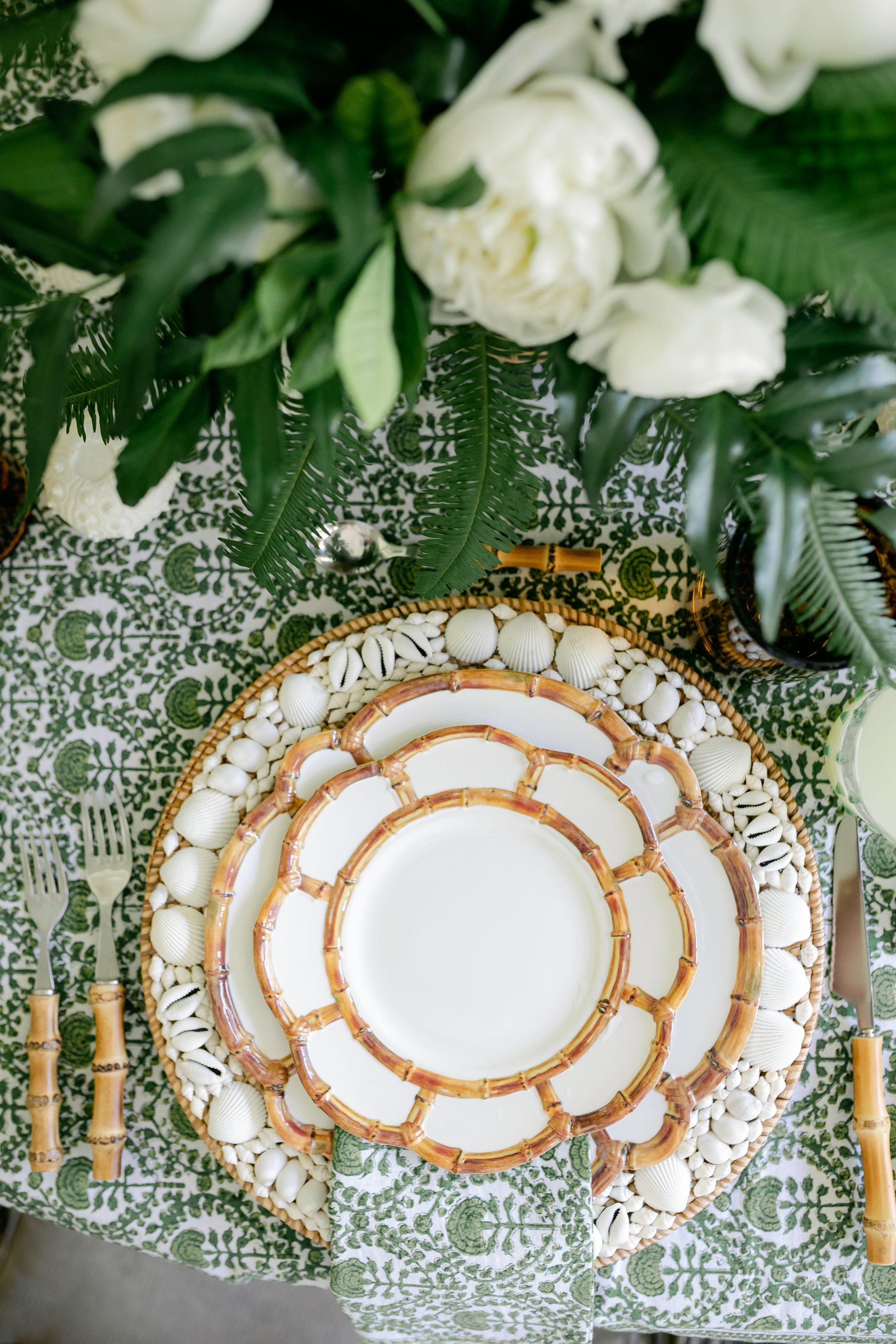

Moodboard

Fonts
Header 1
Header 2
Header 3
Header 4
Body copy
Reckless Neue Thin, All Caps
Reckless Neue Thin
Reckless Neue Thin Italic
Neuzeit Grotesk Regular, All Caps
Minion Pro Regular
Colors
Off White
#FAFAF7
Sky Blue
#EAEDEB
Martini Olive
#BCBB66
Sage
#98AA86
Spruce
#5C6C4F
Brand Concept

Primary Logo

illustration stamp

monogram STAMp

wordmark
We hope you enjoyed your style guide.
Here are your next steps!
As a reminder, your assignment is to offer feedback from the perspective of your target audience and in alignment with your broader goals for the future of your business. Rather than narrow your focus to a particular image, font, color, or word, consider whether the net effect of these elements combined produces a mood or feeling that will connect with your target audience.